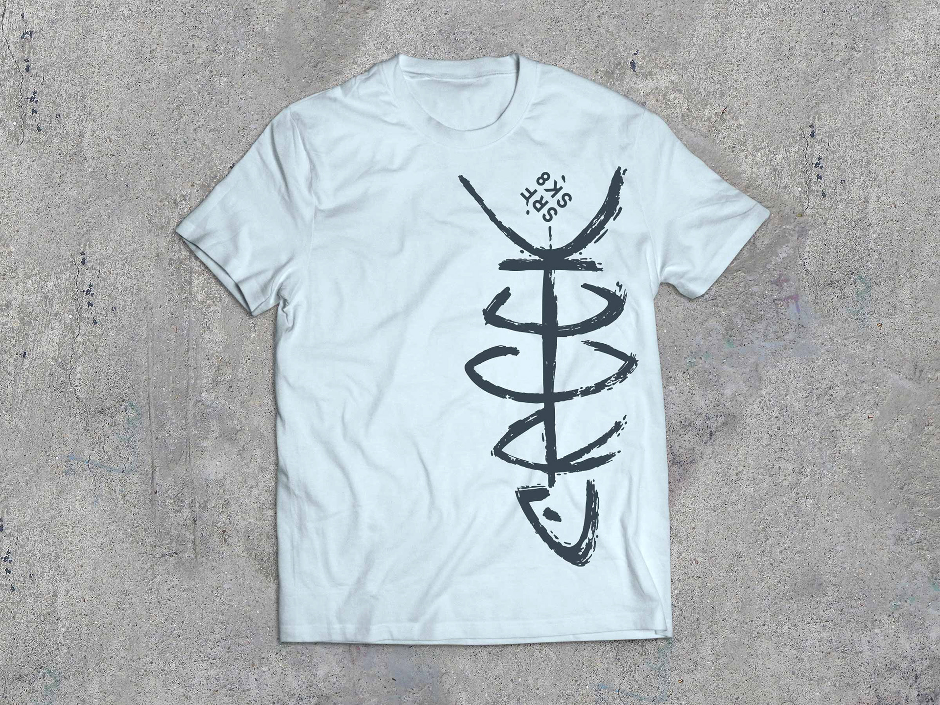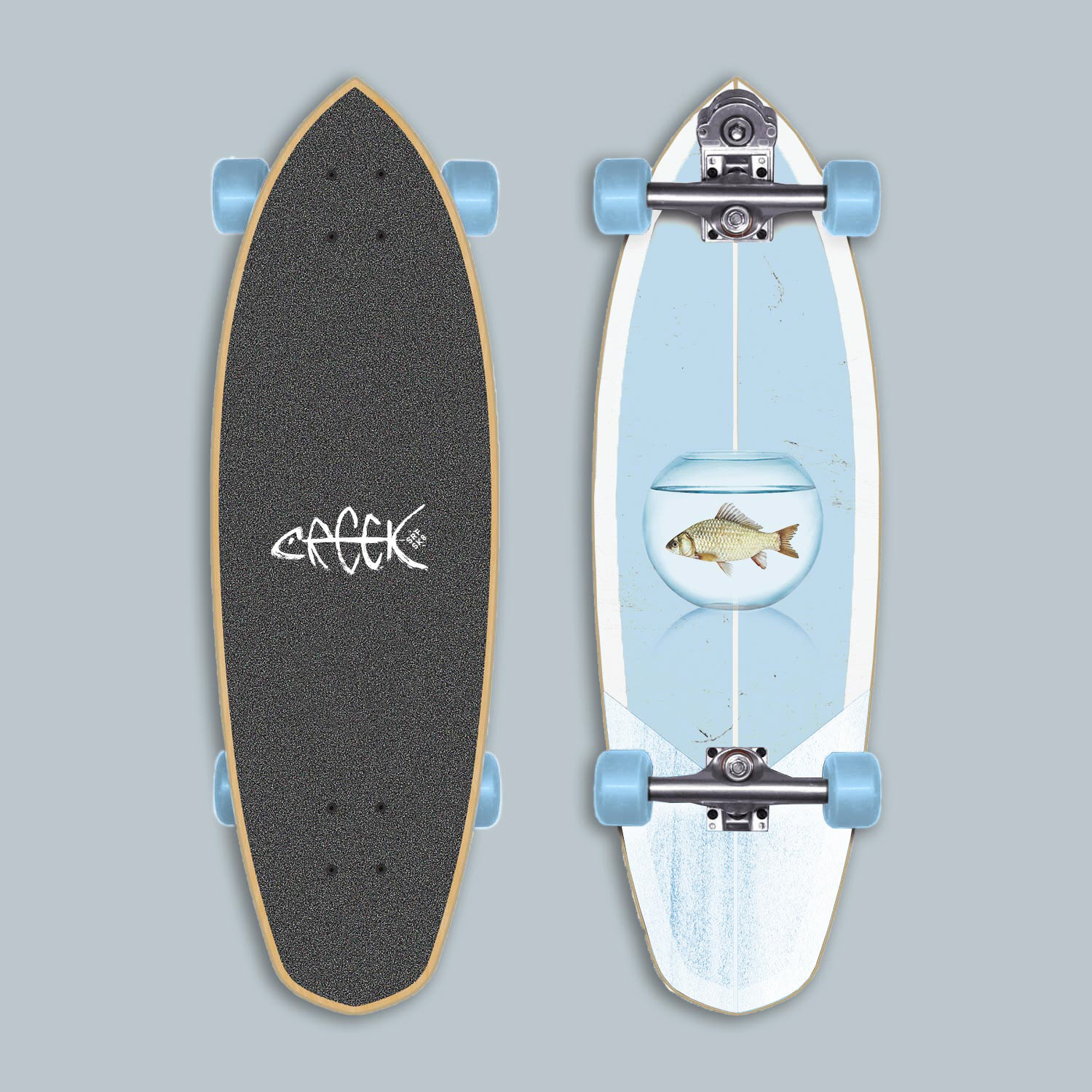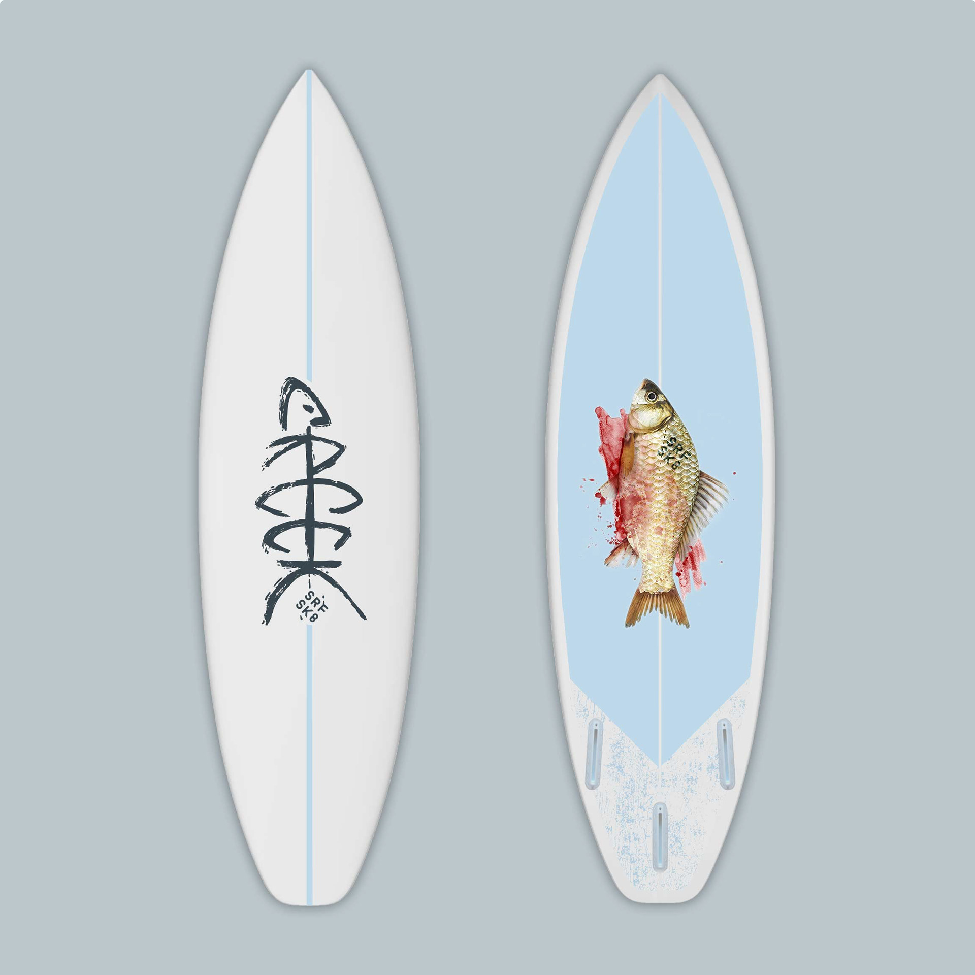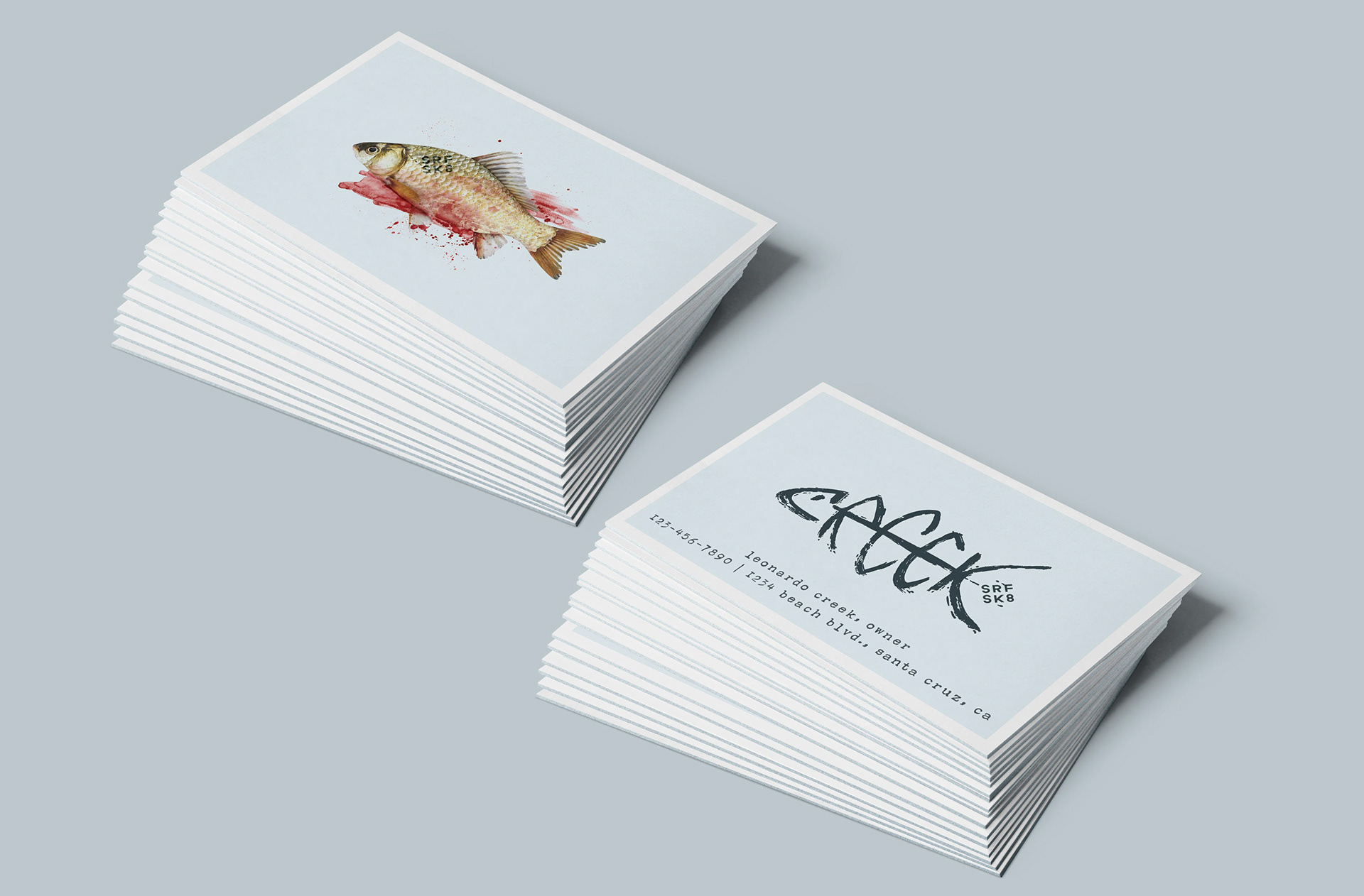


A self-generated project, Creek SurfSkate is a fictional surf and skateboard shop. For the logo, the word "creek" is formed to look like the bones of a fish. To capture the look of flowing water, a brush was used to create the linework. The brushwork also gives the logo some rawness and attitude to appeal to the extreme sports demographic. Additionally, to bring more interest to the brand, I added a fish in a bowl and a bloody fish to the visual identity. These appear on the flip-side of the logomark on the skateboard, surfboard and business card.
